Visual Identity and Brand Guidelines - BitTorrent
Updating a classic brand for one of the original pioneers of the internet.
As the world's largest distributed network BitTorrent is a force that powers massive data movement across the web, utilized by industry giants like Facebook, Twitter, and Wikipedia. However, with time, its brand identity had become fragmented and inconsistent.
Our mission was to give BitTorrent a fresh, cohesive visual language that reflects its groundbreaking role in the internet’s evolution and to revamp the BitTorrent website, visited by 100 million people every month.
2023
Visual Design System
Brand Guidelines
Website Redesign
Roles
Creative Director - Michael Charles Brown
Visual Designer - Johann Banta
UX Designer - Briana Jackson

The Challenge
BitTorrent’s brand had become disjointed, with various teams and departments creating materials with an inconsistent look and feel. As the company expanded its scope, the brand identity needed a significant update. The lack of cohesion diluted BitTorrent’s ability to communicate its mission effectively to a global audience.
Our objective was to reimagine BitTorrent’s brand identity, create a comprehensive visual design system, and refresh its website, seen by 100 million users every month.
The Solution
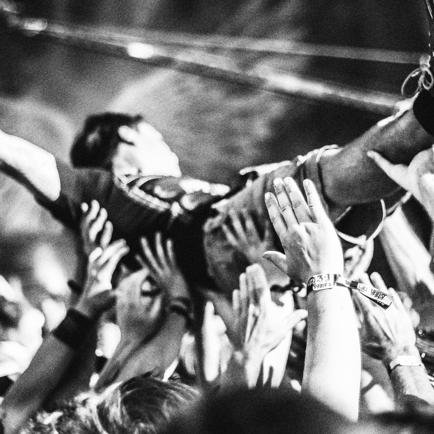
BitTorrent is deeply rooted in Silicon Valley’s ethos of disruption, counter-culture, and innovation. Our creative direction embraced the irreverent spirit of the early internet but framed BitTorrent as a public utility and leader in the fight for net neutrality and online privacy. This ethos guided our visual execution, leaning into black-and-white photography, bold typography, and minimalist layouts to evoke a sense of bold, forward movement and technological freedom.


As Creative Director, I led a multidisciplinary team in close collaboration with engineering, business development, and marketing.
Research
Brand Audit
To ground our redesign in real-world user behavior, we conducted an in-depth audit of BitTorrent’s web properties and communications.
Target Audience
Product data revealed our core users as middle-aged, tech-savvy individuals, skewing male, worldwide. This group not only uses BitTorrent for its peer-to-peer capabilities but also values privacy and the disruptive power of decentralized technology.
A/B Testing
Through a series of A/B tests, we validated our design choices, measuring how changes in information architecture and visual presentation affected key metrics like product downloads and engagement. This iterative approach allowed us to fine-tune the redesign for maximum impact.

"The end result was a website that exceeded our expectations in all areas, both from a creative perspective to fulfilling the business need - materially higher user conversions."
Renn Ortenburger - Director of Business Development


“Our team was very efficient, got things done on time, and produced high-quality work."
Johann Banta - Visual Designer

Outcome and
Impact
The brand refresh had a profound impact, both internally and externally:
Increased Downloads
The redesigned website contributed to a significant uptick in product downloads by improving user flow and simplifying navigation.
Enhanced User Experience
Streamlined information architecture and a cohesive design made it easier for users to discover BitTorrent’s diverse product catalog.
Brand Recognition
BitTorrent re-established itself as a prominent figure in the tech space, particularly in discussions around privacy and decentralization.
Engagement on Social Channels
We saw renewed engagement on social platforms as the brand’s visual overhaul resonated with a larger audience.


Key Takeaways
In any long-standing company, a brand can lose its edge when various teams aren’t aligned. Clear, consistent guidelines empowered everyone from marketing to engineering to communicate a unified brand message. Ultimately, our efforts reestablished BitTorrent as a mainstay of Silicon Valley’s innovation ecosystem, cementing its role as an early pioneer of the internet’s disruptive potential.
MCB Creative is the design studio of Michael Charles Brown, creative lead and visual designer based in Los Angeles, specializing in branding and product design.
Say Hello.
Got a project in mind? I'd love to hear about it.
Phone: +01 415 828 1416
Email: hello@mcb-creative.design